This post of part of a set of three. The main one (What is “abnormal” weather?)Fdifferent has two ancillary ones dealing with the issues of Trends in climatological time series and The statistical distribution of some climate variables
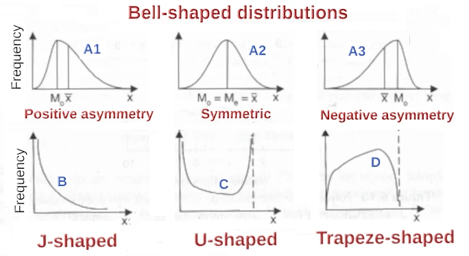
Figure 1: typical statistical distribution shapes found in climatological variables. Mo is the mode, the most frequent value, Me is the Median and x-bar is the average. Redrawn and translated based on Guyot, 1999. Next to the illustrated “flipped” J-shaped curve (B), there is also an “actual” J-shaped distribution which looks like the right-side half of curve C . Featured image modified from a cartoon by Bob Englehart. Click here for source.
What is the statistical distribution of a variable?
The statistical distribution of any variable, including climatological records, is an empirical way of showing and assessing how the variable is distributed over its range of variation. It is an essential descriptor used in a number of applications, including the characterization of change and risk assessments.
There are many ways of describing weather and climate variables1. We will approach this with a made-up2 example of “April total monthly rainfall” (in mm) for a hypothetical location for the 50 years from 1951 to 2000. Here is the list of values recorded from 1951 (81.6 mm) to 2000 (65.1 mm):
81.6, 15.1, 78, 24.4, 16.4, 34.5, 31.8, 50.9, 55.3, 34.1, 95.2, 69.4, 41.9, 50.3, 102.7, 61.7, 30.1, 25.1, 67.3, 92.3, 26.0, 79.6, 86.6, 26.4, 66.1, 10.1, 72, 55.1, 68, 46.3, 40.4, 35, 79.1, 26.1, 105.7, 56.6, 22.5, 22.5, 93.2, 62.3, 69.4, 56.5, 32, 52.8, 51.3, 0.6, 24.4, 107.2, 71.0, 65.1.
It is convenient, to start with, to rank the values from the lowest (0.6 mm in 1996, five values from the end) to the highest one (107.2 in 1998, three values from the end):
0.6, 10.1, 15.1, 16.4, 22.5, 22.5, 24.4, 24.4, 25.1, 26, 26.1, 26.4, 30.1, 31.8, 32, 34.1, 34.5, 35, 40.4, 41.9, 46.3, 50.3, 50.9, 51.3, 52.8, 55.1, 55.3, 56.5, 56.6, 61.7, 62.3, 65.1, 66.1, 67.3, 68, 69.4, 69.4, 71, 72, 78, 79.1, 79.6, 81.6, 86.6, 92.3, 93.2, 95.2, 102.7, 105.7, 107.2.
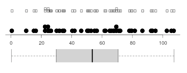
As shown in Figure 2, values can then easily be plotted on an axis as little square boxes (stripchart) or dots (dotplot), superposing the boxes or dots in the case of identical values (i.e. 22.5 mm, which occurred in 1987 and 1988) of when the interval is very crowded (e.g. the values near 70 mm). The boxplot is somewhat more complex as it displays the extreme values, the median and upper and lower quartile in such a way that 50% of all records are included in the grey area. Thew values are:
1st Quartile: 30.5 mm (25% of values are below 30.5 mm: 0.6 mm to 30.1 mm)
Median or 2nd Quartile: 54.0 (rounded from 53.95, the average of 52.8 and 55.1)
3rd Quartile: 70.6 (25% of values are above 70.6 mm, 71 to 107.2).
Displaying the data as a histogramme
The next step is the represention of the data as a vertical bar-chart (a histogramme or histogram in US spelling) as in Figure 3. Let us assume that the interval from 0.6 mm to 107.2 mm can be “generalised” as 0.0 mm to 110.0 mm, and then subdvided into 11 buckets (“bins”) from 0.0 mm to 9.9 mm3, from 10.0 mm to 19.9 mm etc up to 100 to 109.9. The first bin has just one observation (0.6 mm), the second has three (10.1 mm, 15.1 mm, 16.4 mm), etc, and the last has 3 as well (102.7 mm, 105.7 mm, 107.2 mm). The counts can be expressed as percentage: the first bin with just one value makes up (1/50, i.e. 2% of the total count), the second has three values (6%) etc and the last has 6% as well.
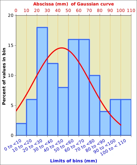
The histogramme has the advantage that we can handle cases where we have hundreds or thousands (and even more) of observations. With large numbers of data, the histogrammes take a smoother look and they are easier to handle mathematically. For instance, the histogramme of our April rainfall data (Figure 3) looks reasonable like a symmetric bell-shaped curve (distribution A2 in Figure 1).
The types of curves that are frequently and routinely observed with climatological data are illustrated in Figure 1. They include a bewildering variety of situations, from the well-known bell-shaped curve, to slanting bells, J- and U-shaped distributions, etc. The main advantage of the curves in Figure 1 is that they can be described with a limited number of descriptors4.
For instance, a symmetrical bell-shaped curve can be described by just two parameters5: the average (arithmetic mean of the observations) and the standard deviation, a measure of how “grouped” the observations are around the average. This applies to the well behaved and somewhat theoretical situations where the histogramme comes reasonably close to one of the theoretical curves in Figure 1. This is shown in Figure 3. The superposed Gaussian (bell-shaped or “normal curve”) has to be interpreted with some caution, however, because it is continuous, while the histogramme represents discrete amounts6. The correct value is read at the right end of the bins. The values about coincide for the bin from 80.0 mm to below 90.0 mm (i.e. 80.0 mm to 89.9 mm).
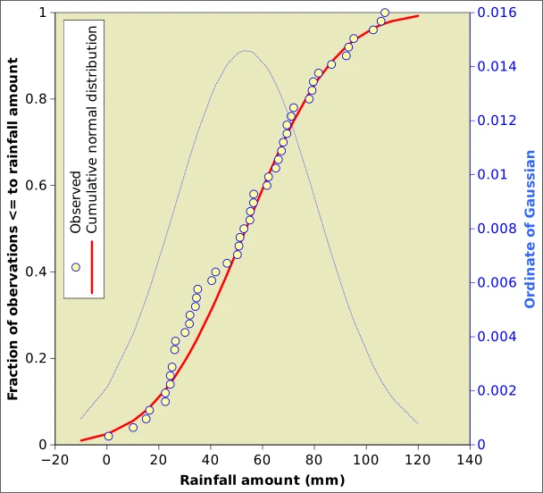
The issue with the discrete counts in bins and the continuous Gaussian is solved by adopting accumulated counts instead of discrete values, as in Figure 4. Here we do not plot numbers of observations in a bin, but the numbers of observations below a certain value. For instance, if we look at the boxplot in Figure 2, we see that 25% of values are less that 30.5 mm and 75% are smaller than 70.6 mm. The information in Figure 4 and the histogramme in Figure 3 are this equivalent.
The statistics describing the data used far in the “April rainfall” example is include the following: Minimum value is 0.6 mm and the maximum is 107.2, as we have already noted. The average(mean) is 54.0 (rounded up, with 1 decimal) and the median is 53.4. The average corresponds to the peak of the Gaussian and the inflexion point in the cumulative curve. The standard deviation is 27.0 and the skewness, which measures if the distribution is leaning to the left (negative values)or to the right (positive values) is 0.187. This indicates a positive, but weak skew.
Although we have been superposing a Gaussian curve to our observations, it remains to be decided whether this is indeed legitimate, i.e. whether the data can indeed be approximated by a Gaussian. This important piece of information can be assessed with an approach known as Shapiro-Wilks test, which is easily available in all statistical software (such as the R Programming language, which I am using for most analyses) and some of the more sophisticated spreadsheets . Even if the impressionistic superposition of the histogramme and the normal curve in Figure 3 does not look too close, the results of the test (W=0.97209 and the p-value is 0.2809), nevertheless tell us that the April rainfall could be approximated by a Gaussian (the normality is accepted when P>0.05)8.
Some real-world statistical distributions
Compared with the previous one, this section is slightly more technical. It illustrates some typical real-world distributions of climatological variables based on data downloaded for Uccle station (50.796862 N, 4.357871 E, Altitude 100 m), historically one of the main stations of the Belgian Meteorological Service. Long-term monthly data are given as such on the website but data for shorter time intervals the data were computed from SYNOP data, which are reported (with many gaps) for 3-hourly intervals for older data and for hourly intervals mostly after the introduction of automatic stations. Daily data were computed by the author of this blog based on hourly records. It is stressed that the examples below were chosen specifically to illustrate different distributions of climate variables. Other locations and different time periods are bound to display different behaviours.
1. Rainfall
Rainfall data distributions are shown for monthly and daily intervals for the conditions described in the three first “blue” columns of Table 1, as well as in Figure 5. Both monthly rainfall histogrammes show a roughly symmetrical distribution (median and average differ very little) as well as a positive skew. The first cannot be assumed to be normally distributed according to the Shapiro-Wilks test, but the detrending has softened the skew, resulting in a normal distribution. The daily data, on the contrary, show a very marked positive skew (skewness of 2.742), a large difference between mean and median and a large coefficient of variation. It can be stated that, for a J-shaped distribution like that of P01d, the usual statistics (moments) are basically meaningless.
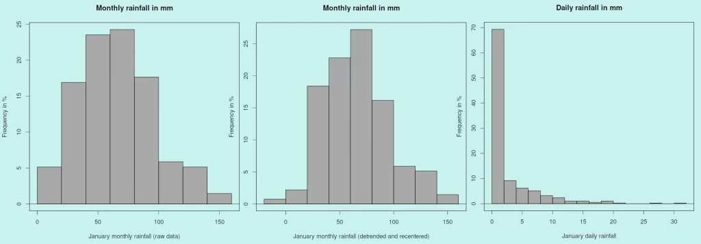
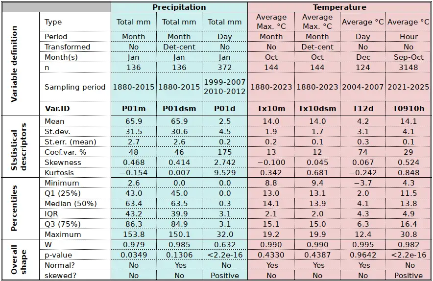
Table 1a: sample of statistics downloaded or computed based on Uccle data. Average temperature was computed from extremes. Daily values were derived from hourly SYNOP values (all data available for the given sampling period). Det-cent indicates that monthly data were detrended over the whole sampling period and shifted to restore the same average as the original series9. Some rounding errors occur in the tables. Refer to note 8 for the interpretation of the results of the Shapiro-Wilks test. “Yes” means that the normality of the data in the pool the sample comes from cannot be rejected. “No” basically excludes normality.
2. Temperature
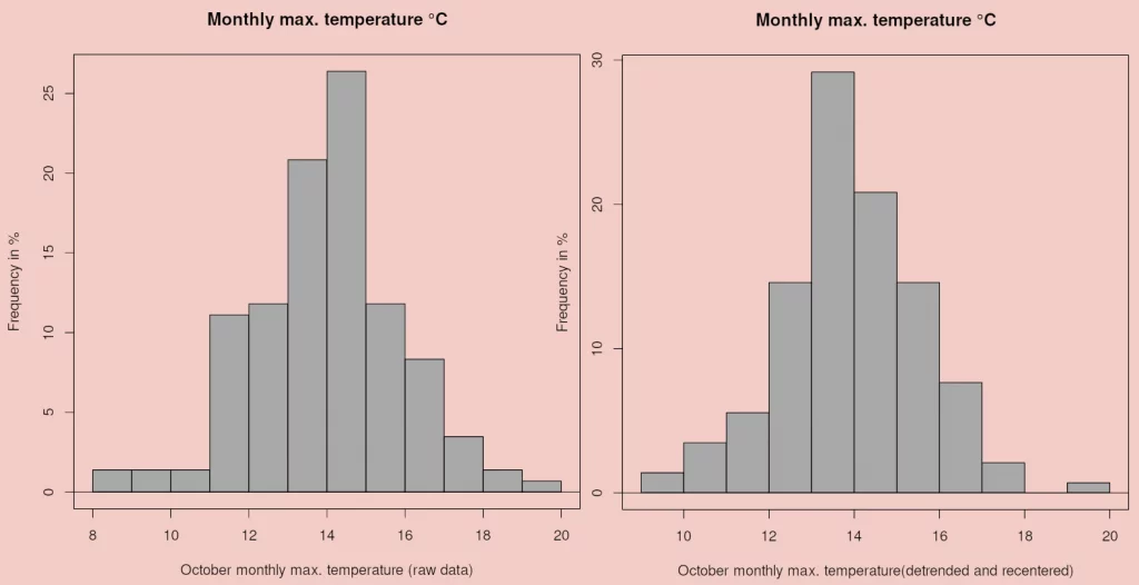
Figure 6 illustrates the equivalent for maximum temperature of the left and central histogrammes in Figure 5. Average monthly maximum temperature is defined as the average of daily maxima recorded during the month. Maximum temperature was selected as a variable for the example at it depends directly on sunshine and cloudiness, whereas minimum temperature usually displays a different pattern as it depends on moisture10. As with rainfall, detrending the series reduces the skew although both Tx10m and Tx10dsm are deemed “normal” by the Shapiro-Wilks test.
Figure 6 displays two histogrammes for shorter sampling periods: daily and hourly. As shown in Table 1a for variables T12d and T0910h, daily values’ distribution tests as “normal” without a marked skew, while hourly values display a positive skew and the distribution is too asymmetrical to qualify as “bell-shaped”, although mean and median are rather similar (14.1°C and 13.8°C, respectively).
3. Moisture
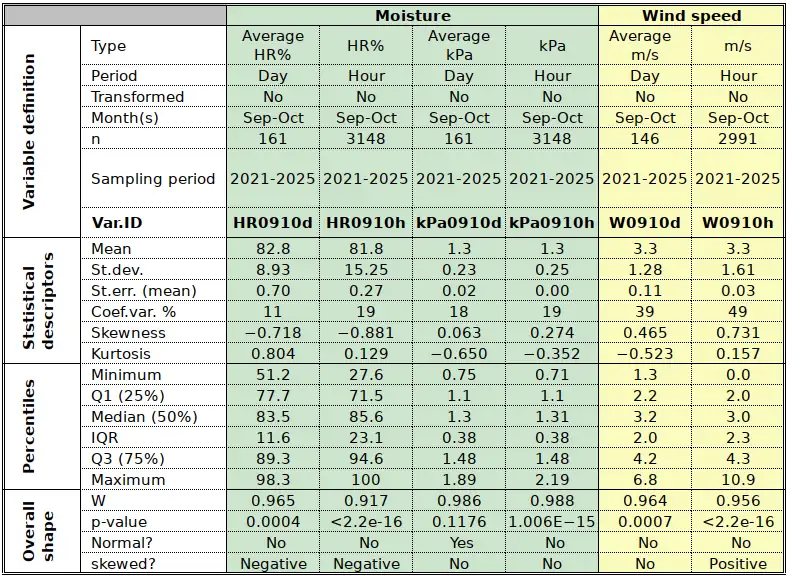
The statistics relevant for Moisture and Windspeed are provided by Table 1b.
Moisture comes in several variants including the traditional “relative humidity” (RH%), which expresses the degree of saturation of air with moisture, in percent, for the prevailing temperature conditions12. It has always been a mystery to me why RH% continues to be used, among others because most biological and physical systems (e.g. evaporation and evapotranspiration) react to the water vapour saturation deficit, not to “relative” humidity. Atmospheric water content is expressed in the same unit as atmospheric pressure, kPa. The average atmospheric pressure is about 100 kPa (or 1000 hPa; refer to the graph in this post). Water vapour pressure contributes to total atmospheric pressure. Table 1b shows values of about 1.3 kPa, which is to say that the “weight” (= share) of atmospheric water contributes about 1% to the total atmospheric pressure.
RH% is mostly meaningless in many ways. To start with, it cannot be averaged13. It cannot be interpreted correctly if it is not accompanied by the corresponding temperature reading. In fact, RH% varies throughout the day not because there is more of less water in the atmosphere, but because the changing temperature changes the values of saturation vapour pressure: low RH% when temperature is high and high RH% when temperature is low. This is shown very directly in the statistical distribution patterns of RH% (U-shaped, figure 1C) and trapeze-shaped (Figure 1D).
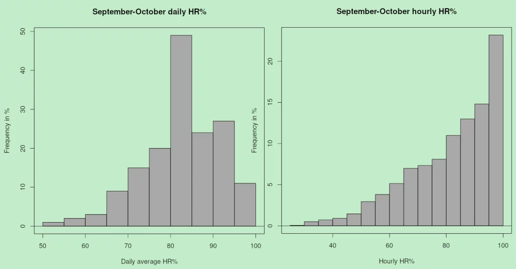
Both histogrammes in Figure 7 are markedly skewed. It was mentioned above that the daily average is not very meaningful; it nevertheless displays an accumulation at high values, which is largely an artifact due to the fact that the variable is bounded between 0% and 100%. In fact, for both daily and hourly values we have a “reverse J-shaped” distribution which is, infact, the right half of the typical U-shaped distribution of HR% values (Figure 1C). For short time intervals (hours), the un-averaged HR% is much more meaningful than for days or even months. In fact, the climate of Uccle is wet, which results on lowest HR% around 50%. In drier climates, or climates with marked seasonality, the histogramme also has values at the lower end, resulting in the typical U-shape. Needless to say, none of the HR% curves comes anywhere near the symmetry required to qualify as “normal”.
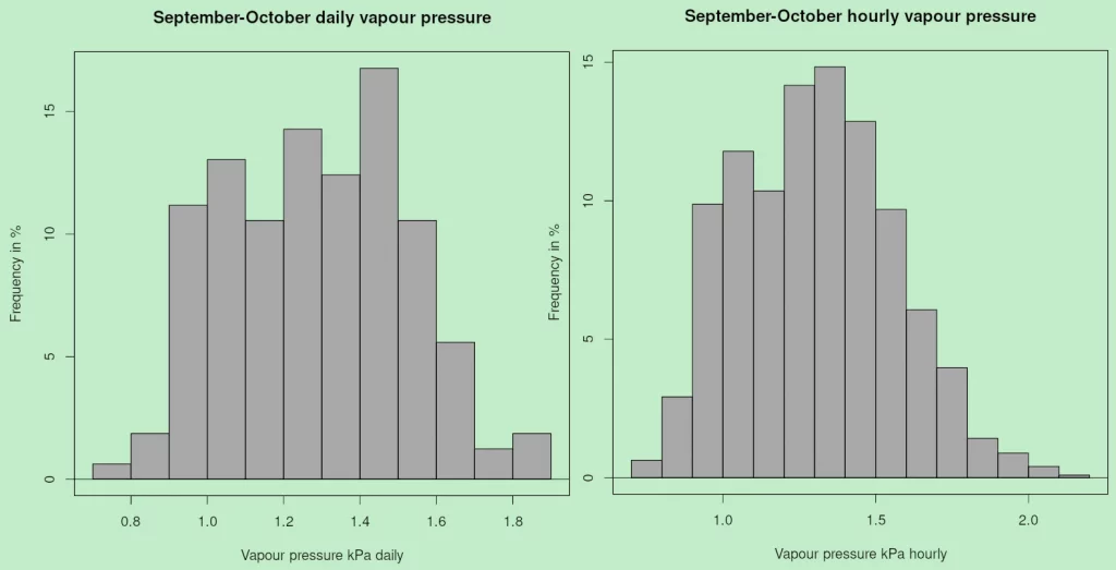
Absolute air moisture (figure 8) come much closer to a well behave variable, with a more symmetric distribution, even if it flattened at central values in typical trapeze-shaped fashion (Figure 1 D). The flattening is clearly apparent in the values of kurtosis (Table 1b). It is noted too that only daily kPa would qualify as a Gaussian. The trapeze-shape, especially on the left in Figure 8, derives from the fact that air absolute moisture changes only little and slowly over time, while HR% moves up and down following temperature values.
4. Windspeed
Except during strong wind conditions, the general public pays usually little attention to wind data. Wind, however, is one of the main factors that conditions evaporation and evapotranspiration, thereby contributing to our well-being and conditioning plant water use, and the ability of plants to photosynthesize.
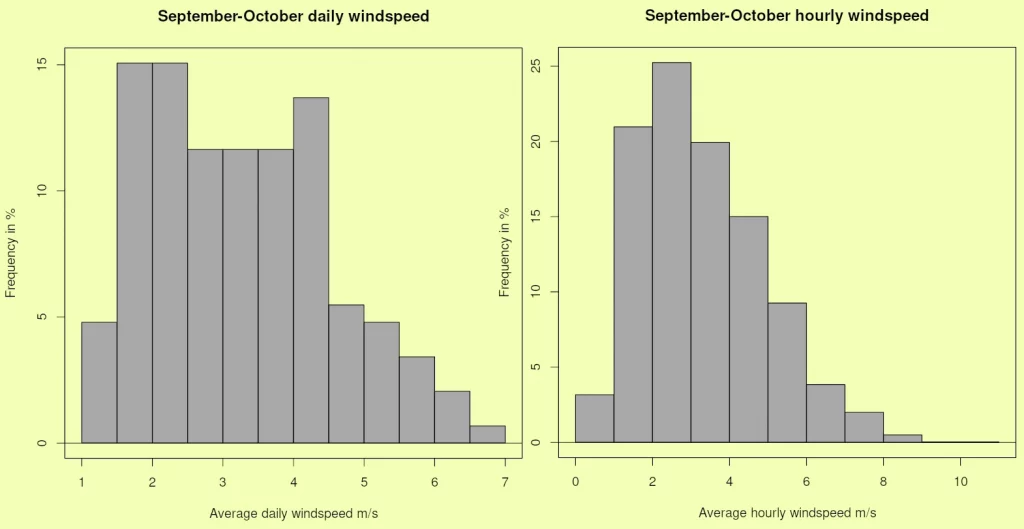
The histogramme in Figure 9 (left) does not really conform to any of the “typical” shapes illustrated in Figure 1. It is close to the trapeze (Figure 1 D) and, like daily kPa (Figure 8, left) results from “background” weak wind being present most of the time and changing little from day to day. Contrary to daily kPa, the daily histogramme is too “flat” to qualify even remotely as a Gaussian. For shorter time intervals (W0910h) we note a marked positive skew which the averaging used to derive daily values has somewhat smoothed. In the specific case of wind, more than for other weather/climate, we have very short intervals of very intense values, usually referred to as gusts, for which there is abundant literature, especially about their “return periods” (Seregina et al. 2014; Yan et al 2022).
5. Other variables
This post listed just some very common weather and climate variables. WMO has a list of Essential climate Variables (ESV) which includes about 50 items, from the chemical composition of the atmosphere, to ocean currents and forest fire statistics. WMO is probably a bit too generous14. Among the more traditional variables directly relevant to ordinary people, we certainly must include such variables as rainfall intensity (mostly J-shaped, Figure 1 B) and solar radiation, the driver of (almost) all life on earth. In the absence of clouds, dust and moisture, solar radiation is a very predictable variable, and even with clouds, aerosol and moisture, solar radiation is among one of the well behaved and mostly symmetric variables (Figure 1 A2; Ayodele 2015 & de Souza and colleagues 2025 for some examples).
Summary and conclusions
This post does not really claim to be technical, let alone prescriptive. Its intent is mostly descriptive. I want to draw the attention to the fact that climatological variables follow certain patterns, even if those patterns vary according to variable (wind, temperature, solar radiation), the location, etc. The statistical distributions even change for the same variable according to the the sampling interval (hourly, or even shorter for wind gusts) to years.
Although the current post is very non-technical (even “impressionistic”), the science of adjusting a theoretical distribution to an observed set of data serves some fundamental purposes. The first is to synthesize many data into a limited number of metrics, such as the average, the standard deviation and others. Once this is done, the distribution can be used for many applications, for instance understanding exactly if and how climate is changing. The distributions are also a basic tool of climatic risk assessments, i.e. understanding what extremes may be expected and assessing where actual extreme events stand on the scale of climate variability (Figure 2)15.
There are some apparent rules, though. Distributions tend to become more symmetric when sampling intervals become longer. Among the listed examples: when water vapour pressure (kPa, Figure 8) and temperature (°C, Figure 6) are averaged from hourly to daily, their distribution becomes more symmetric and could even pass for “Gaussian”. However, some variables accumulated over rather long time periods (months) are still “not normal” (i.e. not Gaussian) in the statistical sense. One of the examples given here is monthly rainfall (Figure 5, left) but detrending the time series normalises it.
As I mentioned, these are not general rules: the described behaviour just happens to occur with the data that were chosen for this post. What this also means, however, is that many procedures which we apply without much thought are not necessarily correct. For instance, comparing a given observation (say winter temperature WT16) with the corresponding average may be meaningless if the distribution of WT is not symmetric. The comparison may even border on science fiction if WT was affected by a trend during the period used to compute the average.
Reférences
Ayodele Temitope R 2015 Determination of Probability Distribution Function for Modelling Global Solar Radiation: Case Study of Ibadan, Nigeria. Int. J. Appl. Sci. Eng. 13,3 233. https://gigvvy.com/journals/ijase/articles/ijase-201509-13-3-233.pdf
de Souza Amaury, de Oliveira-Júnior José Francisco, Carvalho Abreu Marcel, Silva de Medeiros Elias, Gautam Sneha 2025 Statistical distribution modeling of global solar radiation in Alagoas, Brazil: A comparative study (2008-2016). Geosystems and Geoenvironment. https://www.sciencedirect.com/science/article/pii/S2772883825000020
Guyot G 1999 Climatologie de l’ environnement. Cours et exercices corrigés. Dunod, Paris. 525 pp.
Seregina Larisa S, Abea Haas R, Kai Bo R N, Pinto J G 2014 Development of a wind gust model to estimate gust speeds and their return periods. Tellus 66 22905. https://tellusjournal.org/articles/10.3402/tellusa.v66.22905
Yan B, Chan P, Li Q, He Y, Cai Y, Shu Z, Chen Y 2022 Characterization of Wind Gusts: A Study Based on Meteorological Tower Observations. Applied Sciences 12(4):2105. https://doi.org/10.3390/app12042105
Notes
- It is not always very clear whether we are dealing with weather or climate. Weather is best described as the current state of the atmospheric environment e.g. right now, it’ s raining, windy and cold! Climate is “usual” weather with some concern about history e.g. during in July, it’s usually rainy, windy and cold! The description of climate assumes that we have made past observations and that we try to summarise a “usual” , or “average” or maybe “normal” situation. ↩︎
- Not quite made up, actually: they are the total amounts of rainfall (mm) recorded at the station of Uccle (Brussels; see text for details) during April from 1951 to 2000. ↩︎
- 0.0 mm to 9.9 mm is equivalent to 0.0 to < 10.0 mm when the observations are recorded with a precision of 0.1. ↩︎
- Although this post is a non-technical description of statistical distributions of climate variables, it should be noted that all the curves in Figure 1 have names, equations, specific areas of application and that they are supported by large volumes of scientific literature. For instance, extreme temperatures are often deemed to follow a Weibul distribution (see here, for instance) and rainfall in semi-arid areas if often described as following an “incomplete gamma distribution” or maybe “lognormal” or maybe a “Pearson III curve” . In wetter areas, however, such as continental Europe, monthly rainfall usually follows a well-behaved bell-shaped curve. Another advantage of the “specific” distribution curves is that they can often describe different situations when adjusting their “parameters”. For instance, daily rainfall often follows a J-curve (i.e. many 0-values and some higher values), but the gamma distribution admits both a bell-shaped distribution and a J-shaped distribution. It can be ” switched” from bell-shaped to J-shaped according to the values a the curve’s parameters. Of course, the parameters are usually more than two! ↩︎
- I am very reluctant to use that word. Statistics such as mean (average), standard deviation, skewness etc are strictly “moments“. However, depending on context, they can be seen as parameters, i.e. switches. For instance, when observing that a bell-shaped curve will move left or right along the x-axis when modifying the average can justify to call it a “parameter”. Same thing about the standard deviations: low values will result in “narrow” bells, but high values will make the bells “flatter” . This can also be achieved with kurtosis, but Kurtosis also affects the extreme x-values, making bells rounder (“fatter”). I have touched on these issues many times, for instance in the post about crop monitoring dialects. ↩︎
- The histogramme has only one value per bin (e.g. 3 observations or 3/50=6% for bin 2) whereas over the same interval the Gaussian varies continuously and displays different values on the left (about 6%) and on the right of the interval (about 10%). What would be required is a kind of step-wise gaussian. This could be implemented using different approaches. ↩︎
- The function is normdist(x,x-average,x-stdev,i) with i=0 for a Gaussian and i=1 for the sigmoid. ↩︎
- Refer to this interesting – and extremely clear – discussion about the interpretation of the Shapiro-Wilks normality test on Stackexchange. I draw a limited sample (say N=30, sometimes less) from a larger pool. My hypothesis is “this sample comes from a normally distributed pool of data”. If the p-value of the test is larger than 0.05, I cannot reject my hypothesis. In other words: it is quite possible the sample comes indeed from a pool of normally distributed data. On the other hand, if p<0.05, then it is likely that the data in the original are not normally distributed. Also remember the test is about the pool where the sample comes from, not the sample itself. ↩︎
- Detrended time series have an average of 0. ↩︎
- This is a feature of moist climates. When temperatures decline over night, it frequently reaches the point were water vapour condenses (as dew or/and fog). Just like water temperature stays at 100°C while it is boiling, the temperature of air stays at the same temperature while water condenses. This effect does not occur in semi-arid and arid climates. ↩︎
- This differs from the traditional approach which is to average the daily maximum and minimum. However, experience shows that using all values or just the extremes leads to almost identical results (see, for instance, Figure Note 18 in this post). ↩︎
- RH has deep historical roots are goes back to the old Hair tension hygrometers. ↩︎
- In fact, it is frequently averaged, but the average of percentages is a very peculiar mathematical being. Think of it for a minute! Same thing for the ratio of percentages, which economists practice without second thoughts! ↩︎
- This reminds me of the now defunct WMO Commision for Agricutural Meteorology (CAgM) which dealt with… agricultural meteorology, including irrigation and desert locusts. In FAO, irrigation was not an agrometeorological issue (it was technically dealt with by the Land and Water Division) and locusts were a plant protection issue under the “Plants and rangeland” Division. ↩︎
- The concept of risk assessment varies significantly among practitioners and technical areas. I.e. a company selling crop insurance will not necessarily adopt a definition compatible with that of a public works engineer. Refer to this link for an overview of crop insurance by the author and François Kayitakire. ↩︎
- In the northern hemisphere, this would be the temperature from 21 December to 21 March, give of take a day or two for leap years and the changing date of equinoxes. ↩︎