This post of part of a set of three. The main one is What is “abnormal” weather? with two ancillary ones dealing with the issue of Trends in climatological time series and The statistical distribution of some climate variables

In a nutshell…
The post illustrates, with some detail, how to identify and to remove a trend1 from a climatological time series, as well as some consequences of the procedure on the data structure. The data used in this “exercise” are given in Annex 1; they can also be downloaded in spreadsheet format.
Presentation of the Uccle (Belgium) winter data
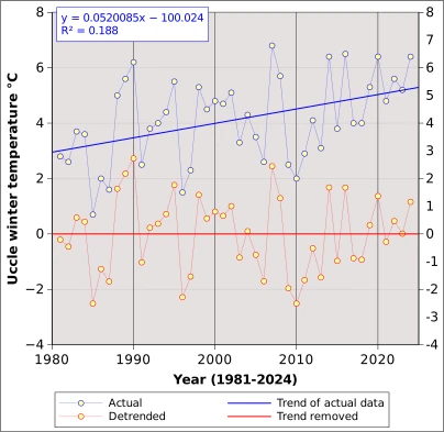
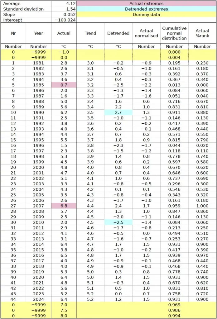
Figure 1 shows average winter temperature at Uccle3, Belgium, between 1981 and 2024. The actual observations (blue) show a consistent tendency to increasing values from 3.0°C in the early eighties to close to 5.0°C in 2024. When the time series is linearly regressed against time, the blue line is obtained. Its equation is shown in Figure 1 and in Table annex 1. The slope (0.052) indicates that the temperature has increased by 0.05°C on average per year, or 0.5°C per decade. The increase reaches 2.2°C over the 44 years between 1981 and 2024 (refer to column “Trend” in Table annex 1. ). The coefficient of determination (R²) of 0.188 indicates that the trend accounts for 18.8 % of the variance of winter rainfall, while 81.2% is due to other factors. If we assume that the increase is due to global heating, that we can say that global heating accounts for just below 19% of the winter temperature increase at Uccle.
Trended and detrended data structure
The annual values corresponding to the equation are given in table Annex 1 in the column “Trend”. If, instead of measuring the absolute temperature we measure it against the “base line” given by the trend line, we obtain “detrended” temperature (“Actual” minus “Trend”). The result of the subtraction of trend values from actual values is shown in column “Detrended” (Table Annex 1) and in red in Figure 1. The “trend” of the detrended temperature is constant at 0.0°C, which is also the average of the detrended time series.
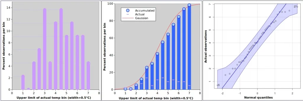
Figures 2 and 3 as well as Table 1 describe the distribution of the Uccle average winter temperature (actual in Figure 2 and detrended in Figure 3). The distribution of actual temperatures looks reasonably symmetrical, with a negative skew (-0.162) and a negative kurtosis (-0.754), meaning that the values tend to lean towards low values and that the curve is “flatter” than the standard Gaussian4. Figure 2 (centre) shows that the distribution of the values is not far off when compared with the Gaussian of same mean and standard deviation. According to the Shapiro-Wilks test, it cannot be excluded that the sample we are considering was extracted from a normally distribution population5. The QQ-plot on the right indicates that all values fall with the 95% confidence envelope of a normal distribution, even if extremes (e.g. point 5, 0.7°C in 1985 and point 27, 6.8°C in 2007 tends to be depart from normality more than central values; refer to table Table Annex 1) .
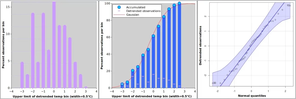
The first observation about detrended series is that dates of extremes do no longer coincide with those in the original observations. Now the extremes occur in 2010 and 1990 (point 30, -2.5°C in 2010 and point 10, +2.7°C in 1990). Detrending has very much removed the skew (skewness -0.033), which is also visible in the QQ-plot of Figure 3 where low and high values remain closer to the theoretical Gaussian than in Figure 2. The overall Shapiro-Wilks p remains similar to the value corresponding to actual values (p=0.487). Kurtosis is unaffected by the detrending and, in this instance, the effect of detrending on the overall shape of the distribution is relatively limited. This is not always the case, especially for variables measured over shorter time intervals, as described in the post on The statistical distribution of some climate variables7.
It is also worth observing that the detrended winter temperature fluctuations of the recent years (e.g. the last 10 years: -1.0°C on 2015 and +1.7°C in 2016) is low compared with the late 1980s: -2.5°C in 1985 and +2.7°C in 1990.
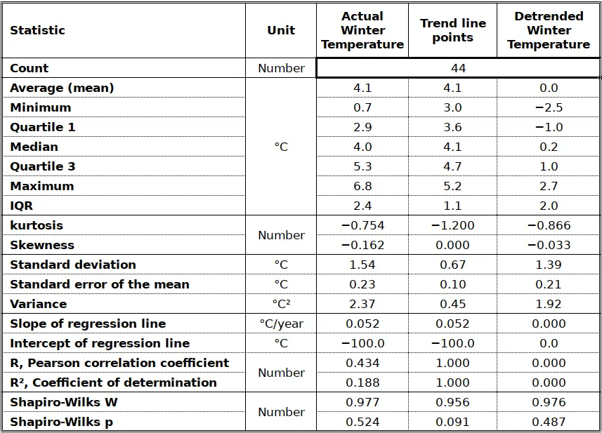
As was mentioned above, the trend accounts for 18.8 % of the variance in the original winter temperatures. Note that this corresponds to the ratio of the variance of the trend line (0.45) to the total variance (2.37).
Is the trend significant?
The trend is significant if the slope of the regression line (0.052; see Table 1) is significantly different from 0. The value given by Gnumeric for the standard error of the regression coefficient is 0.017 and the corresponding t-statistics is t=3.1 (0.052/0.017). The rule of thumb is that the variable attached to the coefficient is meaningful when t exceeds two8 and the value of 3.1 would make us assume that the trend affecting winter average temperatures is meaningful beyond p=99.9%.
However… there are several additional considerations to take into account. The first issue is autocorrelation in the series. Just like the mean is assumed to be stationary for the Gaussian distribution to be meaningful, the values in the time series are assumed to be independent, i.e. each year’s value is independent from the previous as well as the following last year’s recordings. We all know this is incorrect, as – statistically at least – the best “forecast” I can make for tomorrow’s weather is to assume that it will be like today’s9, and nolens volens we are learning that this applies also to longer time periods, for instance next year’s summer heatwave will be as unpleasant as this year’s.
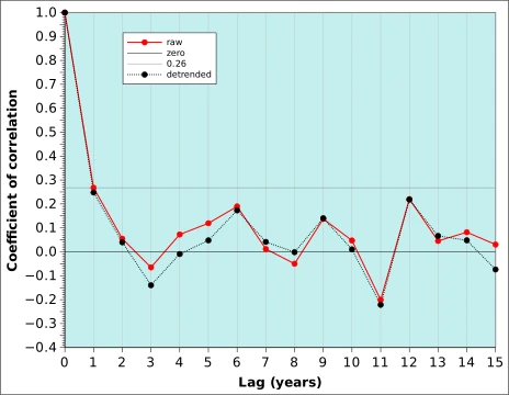
Figure 4 shows the autocorrelation function of the Uccle winter-time average temperature with a lag from 0 to 15 years (in red). The actual number of years used in the calculation decreases by 1 for every year in the lag, i.e. 1 lag years correlates 2024 with 2023, 2023 with 2022 etc up to 1982 with 1981 (43 years) while a lag of 15 years has only 29 couples of years available. The correlation coefficient between the winter temperatures of every year Vs the previous year amounts to 0.267. The result of this relatively high correlation is that our series of n=44 years contains less information than if the 44 values were independent, i.e. there is an “effective value of n” that is actually less than 44. Based on this document from the School of Earth and Atmospheric Sciences, Georgia Institute of Technology, it is easy to compute that the effective n is 2510. This also affects the value of t which is now t=2.3311.
Figure 4 also shows that the autocorrelation function is basically unaffected by detrending. With r=0.268, the persistence can be said to account for about r²=0.071 or 7% of the variability of winter temperature.
The second issue relates to the fact that we are not considering that the trend could be negative, so that we are interested only in a one-tail test. If we refer to this standard t-table and the corresponding Student t-value calculator we find that the cut-off value for the one-tailed test at p=0.05 is t=1.711 with N=24 (25-1) degrees of freedom. With p=0.01, we find that the cut-off value is 2.492 and we would accept he hypothesis that the slope is nil, i.e. that there is no trend.
Summary: can we live with the tends?
The purpose of this post is mainly methodological. It explains how a trend can be extracted from a climatological time series, and how the extraction affects the statistical distribution of the data items that make up the time series. We also look at trends and try to assess their significance levels.
We start with a time series of 44 winter average temperature values at Uccle, Belgium, between 1981 and 2024. This time series is affected by a clear warming trend, with increasing values from 3.0°C in the early eighties to close to 5.0°C in 2024. This correspond to a warning of about 0.5°C per decade. The mean cannot said to be stationary, but the distribution of values can nevertheless pass for Gaussian, albeit with a negative skew. The trend accounts for 18.8% of the variability of winter temperature which is to say that four times more (81.2%) is due to “other factors”. When the trend is removed, the skewness is reduced.
When autocorrelation is taken into account, the trend is significant at the 95% confidence level, but loses it significance at the 99% level. If autocorrelation is ignored, the trend remains significant beyond p=99.9%.
Altogether, in the specific example used in this post, we can live with the trends. Statistically, that is! The data set distribution may well be Gaussian, and the statistical analyses assuming normality can be applied. Depending on how the significance of the warming trend is assessed, the slope of the trend line may not be different from 0. Yet, the warming is real. We probably need to wait another couple of years for the statistics to align with our subjective perception12: no snow, little frost, messed up phenology and pests surviving winter! In the meantime, it would be reasonable to temper our statistical orthodoxy somewhat in order to adapt it to reality.
Annex
The data used in this post are listed in the table below. They are also available as three spreadsheets in Gnumeric, Excel (xlsx) and OpenDocument (ods) formats. The original is Gnumeric, from where the two other formats were exported. The ods file was verified in LibreOffice and the xlsx on an online excel viewer (that particular viewer works even if cookies ere not accepted) . Click here to download the files in their various formats: zipped gnumeric13, ods, xlsx. Five dummy low and high temperatures were added to extend the range of the cumulative normal distribution values.
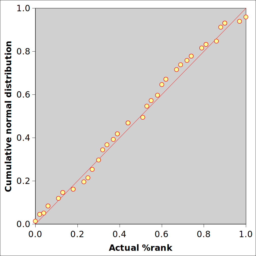
Figure Annex 1 after the table shows the plot of the last but 1 column (Column 7: Cumulative normal distribution) against column 8 (Actual %rank) which is a variant of the QQ-plot (Quantile-quantile) of which another representation is given in the rightmost graph of Figures 2 and 3.
Notes
- Removing a trend is usually referred to as detrending. A time series is said to be stationary if it does not display a trend, i.e. if the average is about the same at both ends. All statistical tests, including those that aim as determining the shape of a distribution, assume that the average is stationary. Although we are dealing here with time series, the same concepts apply to other trends. For instance, when mapping the value of a variable over a landscape (this could be temperature, but it could also be soil Cadmium content or the relative abundance of magpies and crows) spatial trends have to be removed first. In that case, the trends are often referred to as gradients, or spatial gradients. If – on average – the variable is higher in the east that in the west, it must be detrended before it can be spatially interpolated using some geostatistical method. After the spatial interpolation, the gradients must be added again. Refer to this post on Mountain climate for some examples of vertical gradients. ↩︎
- This is repetition from Note 6 in What is “abnormal” weather?. A dekad (spelled with k) is a ten-day period used in agrometeorology and climatology, when an operational length of time shorter than a month is required. The term was originally recommended by the (now defunct) WMO Commission for Agricultural Meteorology to avoid the confusion with “decade” which has come to mean “10 years” in English. Other languages (e.g. French) more logically refer to decennia (or decenniums, 10 years) and decades (10 days) ↩︎
- Refer to the post The statistical distribution of some climate variables, the section on Some real-world statistical distributions, for the source of the data. Additional information is provided in post What is “abnormal” weather? ↩︎
- Both skewness and kurtosis are 0 in the standard Gaussian. Compared with the theoretical Gaussian, negative skewness results from “excess” observations below the mean and negative kurtosis indicates a shortage of central values compared with the edges of the distribution. ↩︎
- This is a repetition of Footnote 8 of the post on The statistical distribution of some climate variables: Refer to this interesting – and extremely clear – discussion about the interpretation of the Shapiro-Wilks normality test on Stackexchange. I draw a limited sample (say N=30, sometimes less) from a larger pool. My hypothesis is “this sample comes from a normally distributed pool of data”. If the p-value of the test is larger than 0.05, I cannot reject my hypothesis. In other words: it is quite possible the sample comes indeed from a pool of normally distributed data. On the other hand, if p<0.05, then it is likely that the data in the original are not normally distributed. Also remember the test is about the pool where the sample comes from, not the sample itself. ↩︎
- This is the “famous” 68-95-99.7 rule. ↩︎
- Variability tends to be reduced markedly by aggregation which, by definition, tends to smooth out extremes. ↩︎
- The rule is convenient with multiple regression, when deciding which variables the retain as explanatory variables because they do significantly contribute to the variability of the dependent variable. Whenever the ratio (coefficient/standard error of the coefficient) > 2, the variable is meaningful (the actual value should be 1.96 at the 95% confidence level; see this table)! ↩︎
- This applies basically to all time scales (hours, days, months, years etc) and is usually described as persistence. It is measured by autocorrelation and is one of the basic statistical forecasting techniques. ↩︎
- Refer to equation 1.36: n_effective = n_actual * ( 1 – r ) / ( 1 + r ), where r is the Pearson coefficient of correlation. ↩︎
- Refer to equation 1.37: t = r * SQRT ( ( n_effective – 2 ) / ( 1 – r ^ 2 )). ↩︎
- I have spared the reader the Fourier analysis of the data, which would certainly have identified “almost” significant cycles, a phenomenon which is directly related with persistence. My experience with cycles in time series is that there are always a couple of years missing for the cycles to be significant. I have even coined this empirical rule: the periodic signal in time series collapses just before it would have become statistically significant. ↩︎
- For some obscure reason, WordPress does not accept to upload Gnumeric files to the media library (uccle_average-winter-temperature_1981-2024.gnumeric This file cannot be processed by the web server) but it does not object to ingest the zipped version. ↩︎